Why It’s Difficult to Nail the Exact Top of a Rally. But It’s Still Doable
Cycle theory founded by JM Hurst explains why it’s much more difficult to nail a top of a rally in the bull stock market rather than nail a bottom in a bear market.
Read the part 1 here: Cycle Analysis of the Stock Prices Was Never That Simple

The founding father of the cycle theory, JM Hurst, proposed that stock prices are driven by a number of underlying cycles that push stock prices up and down.
JM Hurst noted that different cycles tend to bottom at one time forming important lows on stocks price charts:

Look at the simplified cycle model shown above. You can see a bunch of sinewaves that periodically go up and down. You can see that each cycle reaches peak and trough after some equal period of time. We call the time taken by a cycle to travel from one peak to another one or from one trough to the next one the period of the cycle.
You can note that the longer the distance between peaks and troughs, the higher the amplitude of that cycle is. If period of a cycle is five weeks, it will be able to push price on a much bigger distance in comparison to a cycle with a period of five days. Hurst called it the Principle of Proportionality; cycles have amplitude that is proportional to their wavelength.
In the Part 1 we concluded that from the Principle of Summation and the Principle of Synchronicity, we can conclude that points when several cycles make bottoms at one time should be aligned with important lows on stock price charts.
In this Part 2 we will study how underlying cycles that drive stock prices reach peaks.
Hurst argued that adding several cycles together we can explain movement of price. He called that the Principle of Summation.
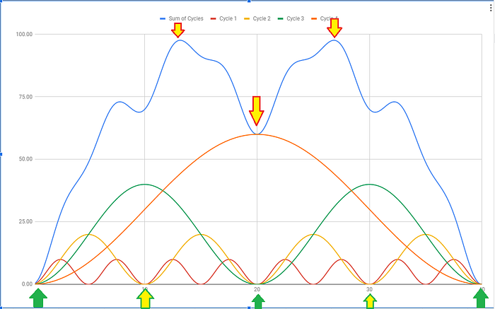
Let’s add to the Simplified Cycle Model a summation line (the blue line) that adds up together all four underlying cycles:

Look at two green up arrows at the bottom. Those are two points where all the indices make their respective bottoms at one point in time making important lows on the respective price chart.
Because cycles get aligned at bottom the multi timeframe version of the Cycle Trader Indicator for TradingView can pinpoint those important turning points:

Such turning points can be found on any timeframe and on any chart of a stock, ETF, futures or crypto currency:

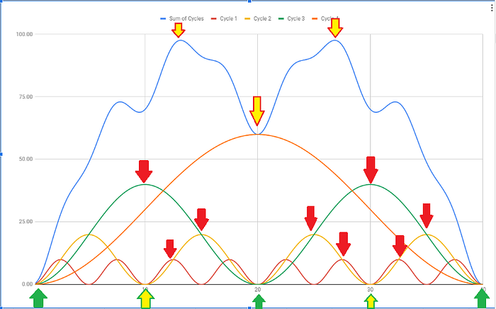
Now let’s come back to our simplified cycle model and look at the way how cycles reach their tops:

Look at the multiple red down arrows. You can see that cycles reach their peaks in asynchronized way! The yellow, red, green and orange cycles top at different times! And when each of them tops we get only a short-term top in the stock price.

Because multiple cycles normally reach their tops at slightly different times long term tops are composed of string of multiple tops. Each of those tops is point in time when one particular micro cycle tops.
To understand how cycles interact at tops imagine a train with several trucks behind that goes over the bridge and then goes down the bridge. And those trucks reach the top of the bridge one by one.

Because different underlying cycles do not make tops at one point in time it makes task of nailing the exact final top of a rally practically impossible.
When the market makes new highs and yet shows some topping signs always bear in mind that rallies tend to extend because there are normally a couple of more cycles that have not topped yet. This is why the traditional technical analysis suggests waiting for lower highs to confirm that the rally has actually topped.

On the chart above you can see red arrows that point tops made by smaller cycles well after bigger cycles topped and turned down. At those points down pressure from declining larger cycles exceeds up pressure of smaller cycles reaching their tops.

In the next article I will explain how I managed to overcome that problem and increase accuracy of topping and bottoming signals generated by teh MTF Cycle Trader indicator:

For a limited time, you can get 12-month access to that indicator for only $149.99.
Read more about the Cycle Trader Indicator here.
Follow me on twitter: @MonkeyMakesSSS
Important Disclaimer
Neither the author nor the publisher of this article is registered as an investment adviser nor a broker/dealer with either the U. S. Securities & Exchange Commission or any state securities regulatory authority. Readers of this article are advised that all information presented here is solely for informational purposes, is not intended to be used as a personalized investment recommendation, and is not attuned to any specific portfolio or to any user’s particular investment needs or objectives.
Trading stocks, options, or futures carries a high level of risk, and may not be suitable for all investors. Before deciding to trade, you should carefully consider your objectives, financial situation, needs and level of experience. The author provides general overview of trading methods that does not take into account your objectives, financial situation or needs. The content of this article must not be construed as personal advice.
Past results are not indicative of future profits.
